🕺🏻Character Posing!🕺🏻
One of the most common mistakes I see when looking at beginner artist’s drawings is two things; stiffness, and lack of personality.
Now, these terms may seem very general and vague, but we’ll be looking into them and how to avoid them in this article!
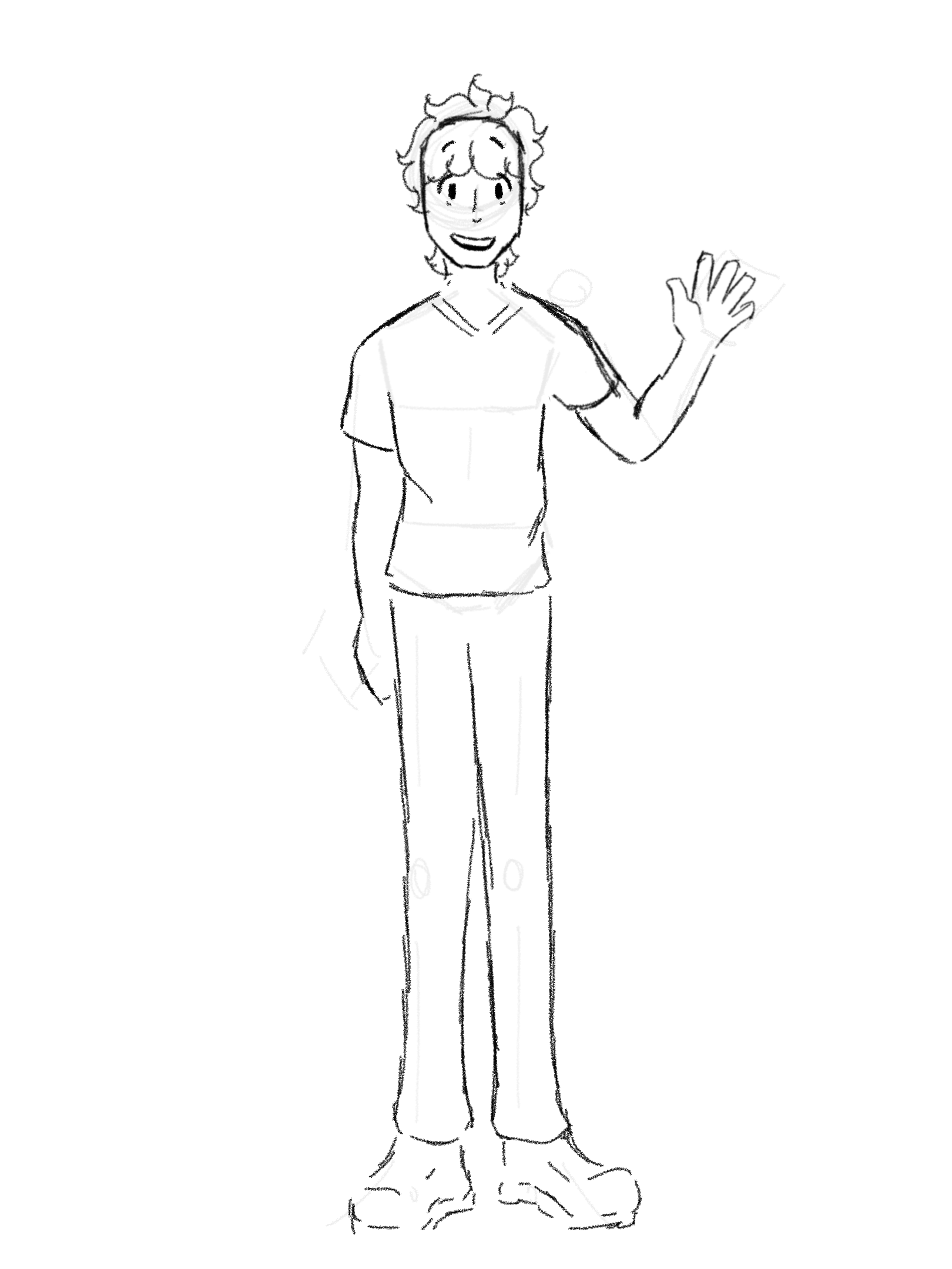
For starters, we’ll be looking at stiffness! Say, you want to draw your character, and so you jot down a quick sketch.
Not bad, right? It doesn’t look like what comes to mind when you think of “stiffness”, which would be more like this drawing I made a long time ago when I was unmotivated.
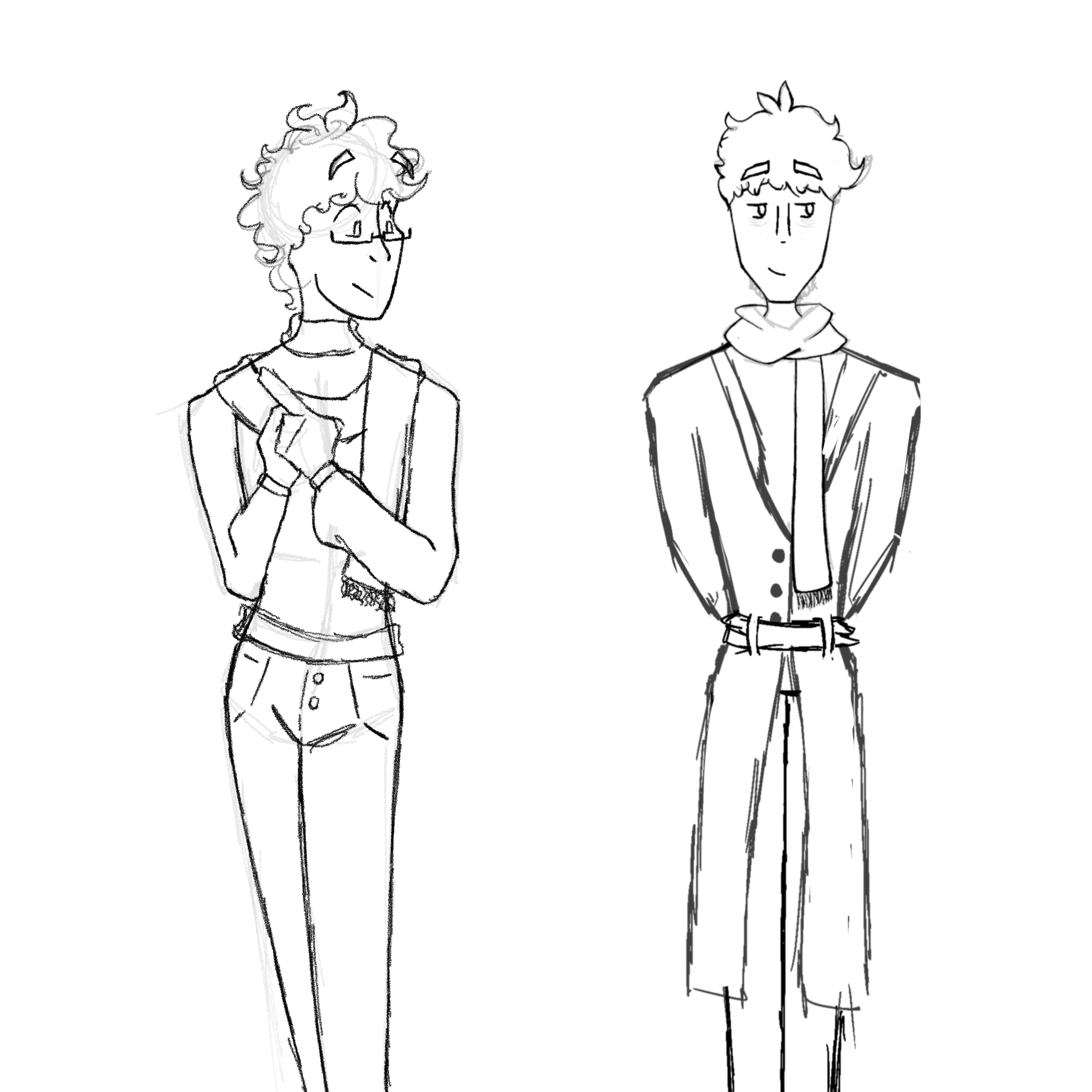
But, of course, there’s always room for improvement! Something I like to do with my characters to avoid stiffness is push the pose and make it at least slightly dynamic. Of course, making great art of your characters doesn’t mean you need to have both, or even one of these things present in your artwork, but I’ve found that when I’m struggling with a character who’s pose seems too bland, it’s definitely helped make it seem more interesting! For example, let’s use these two characters of mine, one that I made before I learned those two helpful tips, and one I made afterwards.
So, how would we apply that to our character?
To start, we’d make it a bit more dynamic, as I mentioned earlier. Now how would we go about doing that?
There’s a very common technique you’ll see in the art community that is a very handy, reliable way to immediately make your characters look less stiff. Of course, it’s not 100% it’ll make your art better, and it’s not necessary every single time, but it definitely helps in most cases! In fact, it’s what I did with the picture above.
That art technique is ensuring the hips and the shoulders never align. Using the example below, you can see on the older design, the shoulders and hips are two parallel lines, while the newer one is more dynamic.
Here’s some more examples!
On our character here, it’d look something like this:
It’s a small thing, but I think it adds a lot!
Now, onto the second mistake, lack of personality!
This one’s a bit more difficult to apply, since there’s a fine line between too simple, and too overwhelming. The best place to start is focusing on who your character is. How old are they? What do they like to do? What’s their favorite colors?
I know this is an art tutorial, but something I learned early on in writing is to figure out who your character is before you even begin to write them. Think of the obscure questions that don't come to mind right away. Do they have siblings? Any pet peeves? What are their long term goals? It may seem silly to bring up writing in an art tutorial, but this tip especially helps me with putting personality into a character's design. Figuring out things like this about your character makes it so that they sort of just naturally bleed into the design itself.
Does this character take care of her little siblings a lot, but care a lot about appearance? Maybe her hair is in an elaborate hairstyle, but still ever so slightly frizzy and unkept, and she likes to wear makeup, but it’s a bit smudged.
Does this character like to read? Maybe she wears glasses because she’s read so much it’s worn out her eyes. Maybe she’s squinting because she just finished binging her favorite book series and her eyes hurt.
It’s little details that really help make or break a character!
Now, back to our character, who is he? What does he like to do? From what we have now, we don’t have much to work with. He seems friendly, because he’s smiling and is waving at us, but we don’t know much else about him. Does he have a job? What are his hobbies? Is he supposed to be a hero, or a bad guy? Right now, it’s hard to imagine him as anything other than just a plain guy you might see walking on the street.
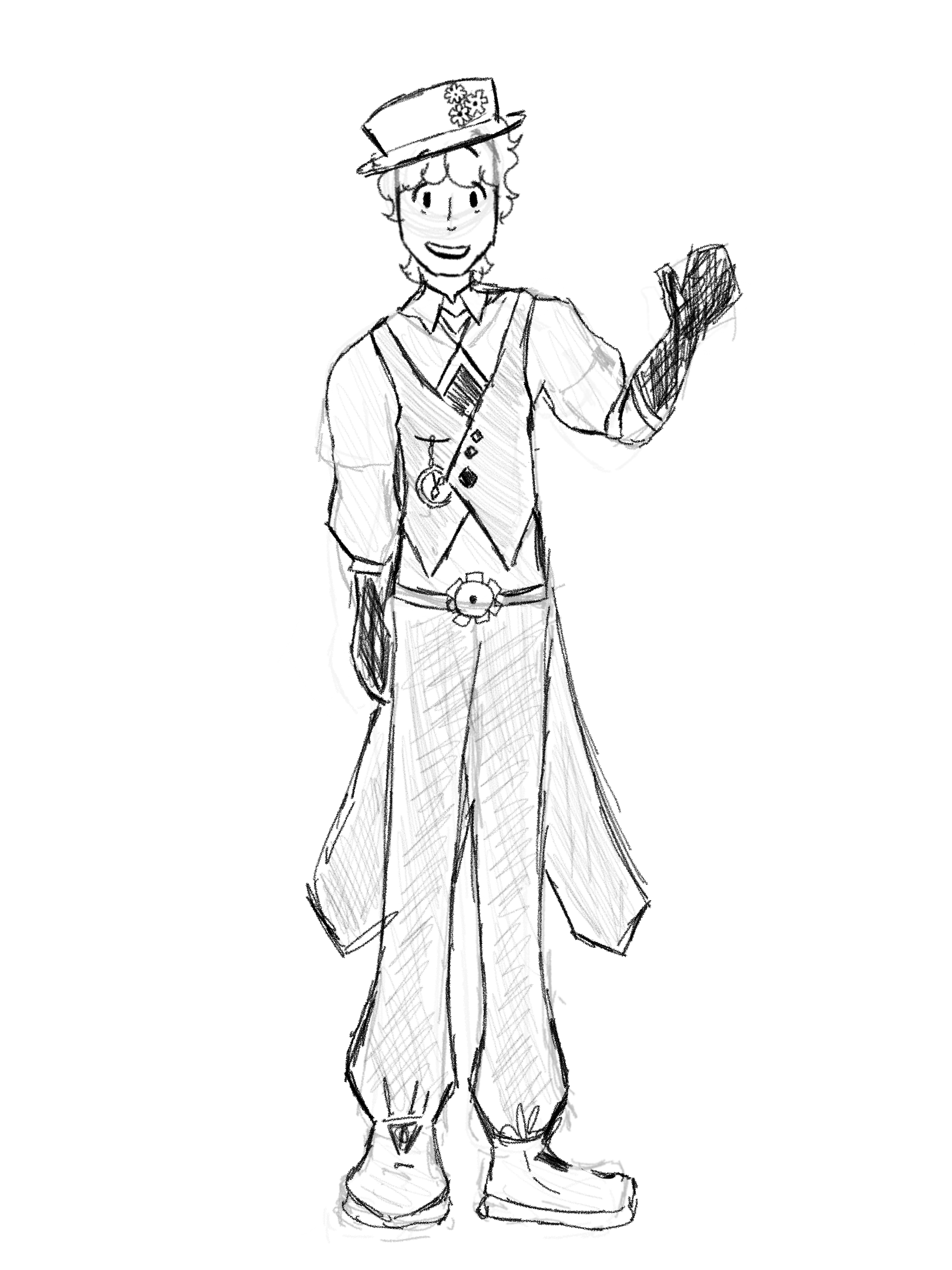
Now, if we decide to make him the eccentric, genius-yet-oblivious lovable villain that’s brilliant with coming up with inventions and lives in a time where everyone dresses like it’s the Victorian era, we can already see there’s a lot of tweaks to be made with our design.
A few ways we could cement these personality traits into him is his outfit, accessories, and style. Maybe we could make him wear an elaborate, sharp-looking outfit to signify he’s a bad guy, and give him cool, gear-themed accessories to show he’s into inventing!
The only issue is…
Now he still looks like just some guy wearing an elaborate cosplay.
How do we fix this?
This is where pose comes into play again! He might have the clothes of an eccentric villain, but he doesn’t seem to feel like one. What is he thinking? How does he feel? Did he just invent something that will help him begin to take over the world? Don’t forget to push the pose!
It’s still very much a rough sketch, but I think it’s much better than what we started out with, don’t you think?
Happy drawing!


